
How to Read Forex Charts: A Beginner’s Guide
Oct
Key takeaways
- A forex chart only shows four pieces of price data per period: the open, high, low and close. Once you can find those, every chart type makes sense.
- Candlestick charts are the standard for most South African traders because the body and wicks show the full story of a price period at a glance.
- The timeframe you choose changes the story. A daily chart shows the trend; a 5-minute chart shows the noise inside it.
- Support and resistance are the levels where price has repeatedly stalled or reversed. Marking them is the single most useful chart-reading habit for a beginner.
- Read charts on a demo account for weeks before risking real money. The scale of the market and the loss rates for new traders both argue for patience.
A forex chart is just a picture of price over time, and you can learn to read one in an afternoon. It plots how much one currency is worth against another, and once you know what the lines, bars and candles are telling you, the whole screen stops looking like static. This guide walks you through how to read forex charts from the ground up: the three chart types, timeframes, price action, the key levels that matter, and how to practise before any of your own money is on the line.
Most of what you will find online about chart reading is written for a global audience and skips the local detail that matters here. We will keep it plain and point you toward the South African context, from FSCA-licensed brokers to trading on SAST, where it helps.
The three chart types: line, bar and candlestick
Every forex chart is built from the same four numbers for each slice of time: the opening price, the highest price, the lowest price and the closing price. The three common chart types simply draw those numbers differently.
Line charts connect the closing price of each period with a single line. They are the cleanest to look at and good for spotting the overall direction at a glance, but they throw away the high and the low. You see where price ended, not how it got there.
Bar charts show all four numbers. Each bar is a vertical line marking the high and the low, with a small tick on the left for the open and a tick on the right for the close. They hold more information than a line, though many beginners find the thin bars fiddly to read quickly.
Candlestick charts show the same four numbers as a bar chart but in a far clearer shape. Each candle has a body between the open and the close, and thin wicks reaching up to the high and down to the low. If price closed higher than it opened, the body is usually green or hollow. If it closed lower, the body is usually red or filled. That colour alone tells you who won the period, buyers or sellers.
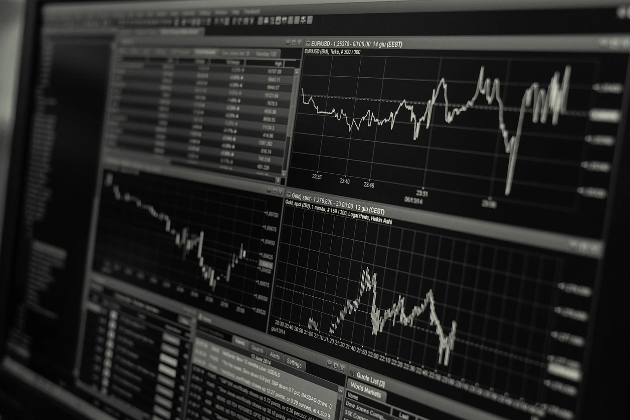
Candlesticks are the standard for a reason. For most South African traders learning the ropes, a candlestick chart is the one to start with and the one your broker platform will open by default.
Understanding timeframes and what they reveal
The timeframe sets how much time each candle represents, and it completely changes the story the chart tells. On a 5-minute chart, each candle covers five minutes of trading. On a daily chart, each candle is one full day. Same market, very different picture.
A short timeframe like 1-minute or 5-minute shows you the noise: lots of small, jittery candles that can reverse in seconds. A long timeframe like the daily or weekly smooths that out and shows the underlying trend. Neither is right or wrong, they answer different questions.
Beginners almost always start too fast. The lower the timeframe, the more decisions you have to make and the less time you have to think. Starting on the daily and 4-hour charts gives you room to breathe and filters out most of the random movement that traps new traders.
A useful habit is to check more than one timeframe before you act. Look at the daily chart to see the broad direction, then drop to the 1-hour to find a sensible spot to enter. Remember that forex runs around the clock from Monday morning to Friday evening, so on the South African clock (SAST) the busiest hours tend to be the afternoon, when London and New York overlap.
How to read forex charts for price action and trends
The core of how to read forex charts is price action: reading what price is doing directly from the candles, without piling on extra indicators. The first thing to read is the trend, the general direction price is travelling.
An uptrend shows a staircase of higher highs and higher lows: each peak is above the last peak, and each dip stops above the previous dip. A downtrend is the reverse, lower highs and lower lows. When price is doing neither and just moving sideways in a band, the market is ranging, and many experienced traders simply wait for a clearer picture.
The individual candles add detail. A long body with short wicks means one side was firmly in control. Long wicks mean price pushed in a direction and got rejected, a hint that the move may be running out of steam. You do not need to memorise dozens of named patterns to begin. Reading the trend, the size of the bodies and where the wicks appear will carry you a long way.
The forex market itself is enormous, which is partly why price moves so smoothly most of the time. Trading in FX markets reached $9.6 trillion per day in April 2025, up 28% from 2022, according to the Bank for International Settlements Triennial Survey. That depth is why major pairs like EUR/USD rarely gap wildly during normal hours.
Spotting key levels on a chart
Key levels are the horizontal prices where the market has repeatedly stalled, bounced or reversed. Learning to mark them is the single most useful chart-reading habit a beginner can build, and it needs no special tools.
Support is a price floor, a level where falling price has stopped and turned back up before. Resistance is a price ceiling, where rising price has stalled and turned back down. The more times price has reacted at a level, the more traders are watching it, and the more it tends to matter.
To find these levels, zoom out to a higher timeframe and look for prices that line up across several past turns. Draw a simple horizontal line through them. You will often notice that once a support level finally breaks, it flips and starts acting as resistance, and the other way around.
Round numbers deserve attention too. Prices ending in neat figures, like 1.1000 on EUR/USD, often act as natural levels because so many traders place orders around them. Marking two or three clean levels on your chart gives you reference points for where a move might pause, rather than guessing.
Practising chart reading before you trade
Open a demo account and read charts for weeks before you risk a single rand. A demo account uses live prices with virtual money, so you can test what you see on the chart without the sting of a real loss while your reading is still rough.
There are two good reasons to be patient. The first is the sheer size of the market you are stepping into; as noted above, the dollar alone sat on one side of 89% of all FX trades in April 2025, so you are trading against deep, fast, professional flow. The second is that a large share of new retail traders lose money in their first stretch, often because they trade live too soon, oversize their positions and let emotion drive decisions. Practice on a demo is the cheapest way to make those early mistakes.
When you practise, keep it structured. Each day, open a chart and name the trend, mark your support and resistance, and note on paper where you would enter and why. Pair that habit with sound risk management for beginners so that small position sizes and a written plan become second nature before real money is involved. It also helps to understand the basics of pricing, such as what a pip is, so the numbers on the chart mean something concrete.
Chart reading is a skill that rewards screen time, and coaching can cut down the months of trial and error. At CTFX School of Trading, where founder Ekraam Ebrahim has coached South African traders since 2017, chart reading is taught hands-on in both private and group settings. Your next concrete step: open a free demo account with an FSCA-licensed broker this week, pick one currency pair, and spend ten minutes a day marking the trend and two key levels. Do that for a month before you trade live, and you will be reading charts, not just looking at them.
Frequently asked questions
What is the best chart type for a beginner?
Candlestick charts. They show the open, high, low and close for each period in a single shape, and the colour tells you instantly whether price rose or fell. Most South African brokers and platforms default to them.
What timeframe should a beginner trade on?
Start on the daily and 4-hour charts. They move slowly enough to let you think, and they filter out most of the random noise you see on 1-minute and 5-minute charts.
Do I need to read charts to trade forex?
Yes. Even if you follow a news or fundamentals approach, a chart tells you where price actually is, where it has reacted before, and whether your entry makes sense. Reading charts is a core trading skill.
How long does it take to learn to read forex charts?
The basics take a weekend. Reading charts well enough to trade with takes months of screen time, ideally on a demo account first. Structured coaching shortens the trial-and-error phase.
Want more of our forex education in your Google results?
